
Logo
Brand Design
Here you can find all the important details about logos, colours and typography.
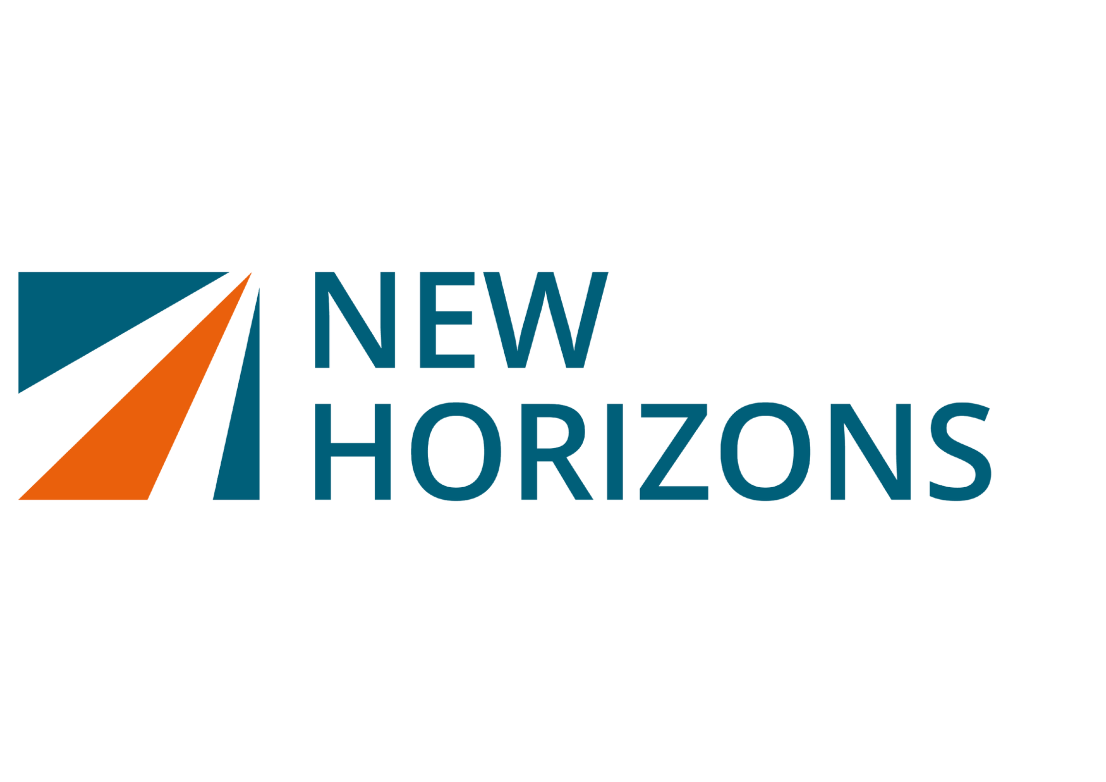
PRIMARY LOGO
Our primary logo is our icon with the words ‘New Horizons’ attached.
The primary logo should be used in most circumstances, particularly in media that is external facing.

HEX #00B7CD
R0 G183 B205
C73 M4 Y19 K0

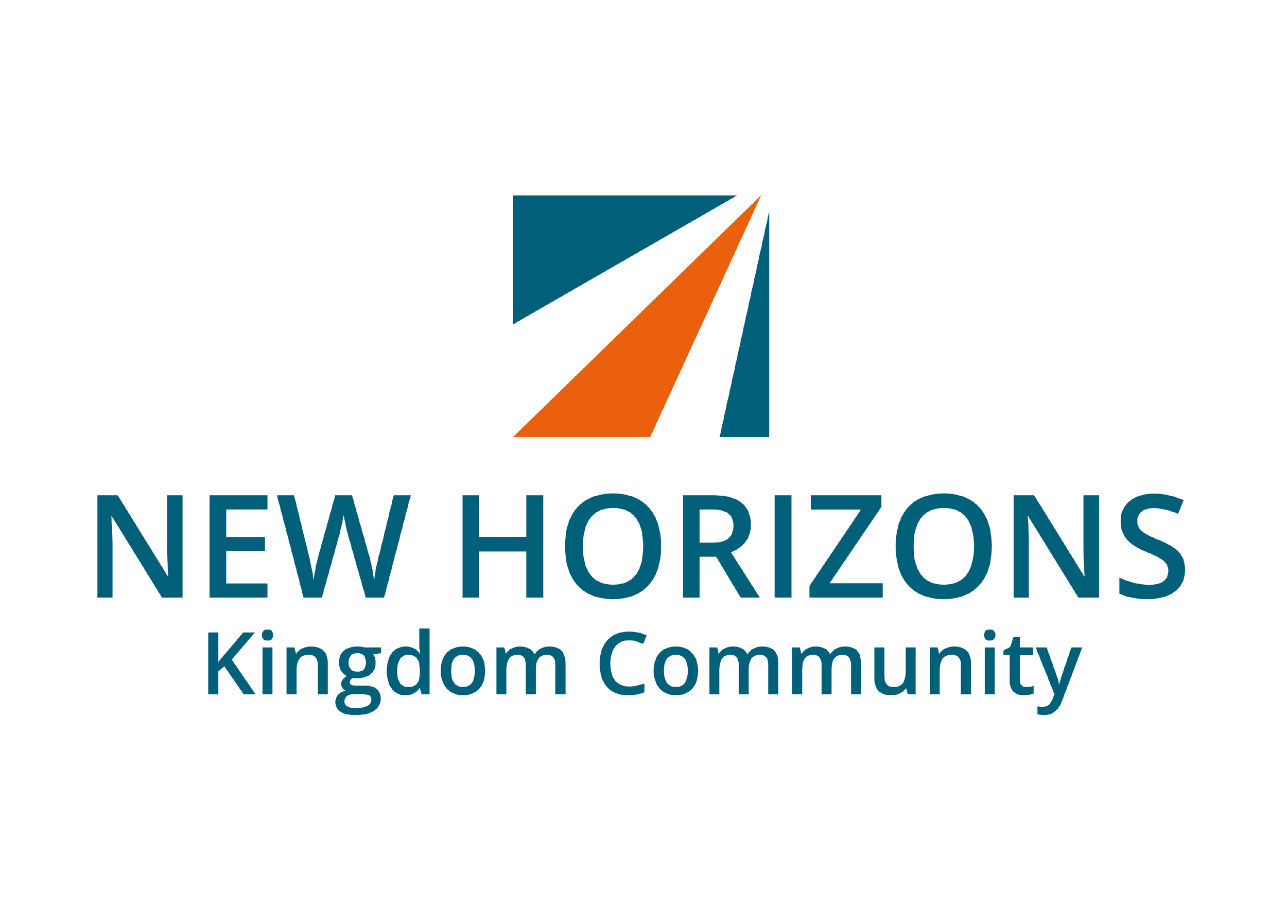
SECONDARY LOGO
The core expression of New Horizons is our Kingdom Community, and so our secondary logo is our icon with the New Horizons text followed by the subheading: Kingdom Community.
The secondary logo should be used for media that is created for the church expression of New Horizons–this could be both external or internal facing. This logo should also be used alongside Congress WBN branding.
PEOPLE GROUP LOGOS
Within our Kingdom Community you will find the People Groups, where every age and stage is tracking maturity and growing together.
Each People Group has a colour associated with it. Hebron GPS and X-Elle GPS match the respective colours of the mens and women’s People Groups as this communicates the fact that the GPS groups are designed to be the on ramps into manhood and womanhood.
These logos are designed for internal use only. External facing media should utilise primary or secondary New Horizons logo.


HEX #00B7CD
R0 G183 B205
C73 M4 Y19 K0


To download any of the logos above, visit the Resources page:


Secondary Colours
LOGO USAGE
The New Horizons logo has been created very deliberately, and so we want to make sure everyone uses it in the way it is intended to be used. By doing this, we are all helping to make sure that the New Horizons brand is clear and accessible and that we represent New Horizons well.
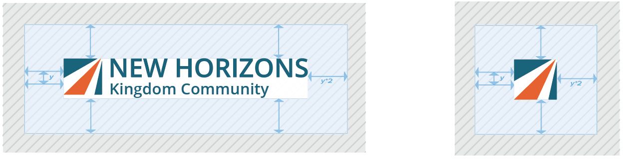
LEAVE SPACE AROUND THE LOGO
It’s important that adequate space is maintained around the logo itself, so please refer to the guide below. The space around the logo should be the same size as the New Horizons icon itself on all sides.
WHAT NOT TO DO!
Do not resize or change the position of the logo mark

Do not use any other font, no matter how close it might look to the logo font.

Do not squish or squash the ogo. Any resizing must be in proportion.
Do not change the colours even if they look similar. Use the official colour specifications detailed in these guidelines.
COLOUR
Colour System
The colours for the New Horizons brand have been very carefully selected, and therefore we want to equip you to use them as effectively as possible. That’s why we have a colour system which will help create consistency in how New Horizons is represented but also ensure that everyone’s designs look great!
only use 1 primary colour
Any design or piece of media should utilise just one primary colour. This colour can be paired with any of the secondary colours, but there should never be multiple primary colours used within the same design or piece of media.
All the primary colours have been chosen so that they work with any of the secondary colours, so by following this system it will ensure that everyone’s designs work effectively.
use colour intentionally
It’s really important to think about what colours you use and why. The primary colours have been chosen to be used predominantly as ‘accent’ colours, and so any larger blocks of colour in your designs should (in most cases) utilise the secondary colour palette.
People Group colours
If you are creating designs or media for a specific People Group, you should use the colour that is associated with that People Group as your primary colour. If your design or media is for community wide events then you can select from any of the primary colours.
use the brand principles
Our brand principles of Depth, Motion, Insight and Simplicity are there to help you think through how you use colour as well. You can refer back to these principles by visiting the Brand Architecture page linked below:
Primary Colours
HEBRON BLUE
EVO YELLOW
CWBN Green
HEX #066E73
R6 G110 B115
C89 M40 Y50 K16
BODY TEXT
Body text should always be lowercase apart from the opening letter of a sentence.
The font you choose should either be Open Sans regular or PT Sans Regular.
The minimum font size for body copy is 10 point to ensure your text is legible.
Predominantly left aligned.
NEED SOME HELP?
If you need any help working out where to find the information you need or how to use the branding effectively, please contact the brand management team and we’ll be happy to help!
CX MINT
HEX #00D0BF
R0 G208 B191
C67 M0 Y35 K0
KC ORANGE
HEX #EA600C
R234 G96 B12
C1 M72 Y100 K0
HORIZON BLUE
HEX #005F79
R0 G95 B121
C90 M47 Y35 K22
HERITAGE GREEN
HORIZON GREY
HEX #404E5B
R64 G78 B91
C76 M61 Y47 K30
HEX #01A95B
R1 G169 B91
C82 M5 Y89 K0
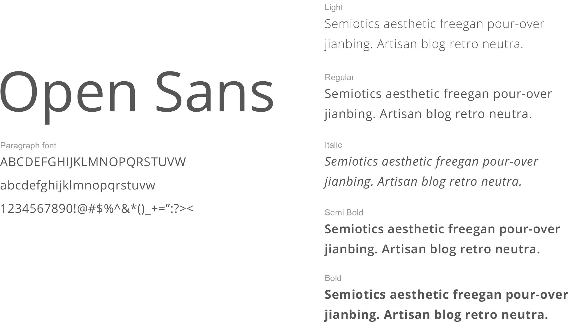
TYPOGRAPHY
The primary brand font is Open Sans. If this is not available then please use PT Sans as an alternative. Make sure these fonts are installed on your computer. You can download the fonts at the links below.

HEADINGS

Always use either Open Sans Bold or Semi Bold or PT Sans bold font for the header.
Ensure there is sufficient space around the heading.
Predominantly left aligned.